


From CHATGPT's response...
✅ Things that can be considered
Similar Grid Layout
Toning Down Borders
Increased Spacing
Consistent Icon Alignment
Collapsible Filter Section
Compact Interactions
❌ Things that can't be considered
Grouping Filters
Progressive Disclosure
🧠 Reasoning
Aligns with the current mental model of the users
Aesthetic Choice (potential to make the UI less overwhelming)
Aesthetic Choice (better breathability and improved white space)
Consistency in UI
Improved focus on the table when needed, flexibility to see or hide filters, aesthetically pleasing
Less space achieving the same functionalities
🧠 Reasoning
This means an extra click in the form of accordion or overwhelming text headings that wouldn't add much value


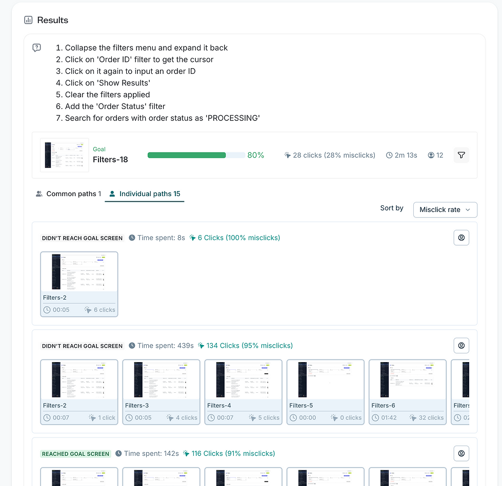
Tried and tested this by having a few filters on the main section, along with an Other Filters button leading to a side Filter Drawer/Panel.
High number of misclicks and difficulty finding the required filter (novelty was considered but every department have their own top 3-4 filters, so it is important to consider all the use cases)


UNINEED
-
DIGITAL PRODUCT DESIGN
-
E-COMMERCE & ENTERPRISE
Redesigning an open-source e-commerce platform and a premium e-commerce fashion & beauty marketplace website.
-
FASHION & BEAUTY
Overview
UNINEED
-
DIGITAL PRODUCT DESIGN
-
E-COMMERCE & ENTERPRISE
Redesigning an open-source e-commerce platform and a premium e-commerce fashion & beauty marketplace website.
-
FASHION & BEAUTY
Unineed is an UK online fashion and beauty retailer offering products from over 450 brands ranging from skincare to make-up accessories.
Team
Me (UI/UX Designer) + Product Manager + Website/PPC Analyst + Front-end & Back-end Devs.
Timeline
Sept. 2023 - Present
Involvment
Identifying user needs, pain points and opportunities. Brainstorming solutions collaborating with the team. Leading the wire-framing and prototyping process. Documenting the hand-offs to developers.
Tools
Figma, FigJam, Jira
01
DISCOVER
-
Product goals
02
DELIVER
-
High-Fidelity Mockups
-
FigJam Docs to hand off
-
User needs, pain points & frustrations
-
User Journey Maps (Existing)
-
User Journey Maps (Proposed)
Overview
Unineed is an UK online fashion and beauty retailer offering products from over 450 brands ranging from skincare to make-up accessories.
Team
Me (UI/UX Designer) + Product Manager + Website/PPC Analyst + Front-end & Back-end Devs.
Timeline
Sept. 2023 - Present
Involvment
Identifying user needs, pain points and opportunities. Brainstorming solutions collaborating with the team. Leading the wire-framing and prototyping process. Documenting the hand-offs to developers.
Tools
Figma, FigJam, Jira
This is what FigMake created...

01
DISCOVER
-
Product goals
02
DELIVER
-
High-Fidelity Mockups
-
FigJam Docs to hand off
-
User needs, pain points & frustrations
-
User Journey Maps (Existing)
-
User Journey Maps (Proposed)
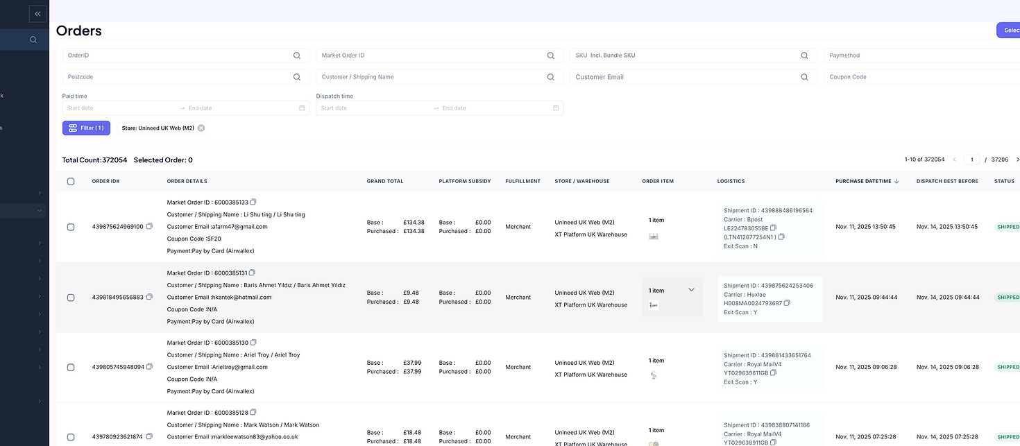
The filters were made compact, which could be considered. However, we face with the same problem of having static filters sets for different sets of audience, who may or may not find it helpful
What are we trying to achieve?
✅ Less Clutter in the Filtering Section
✅ Same Number of clicks to apply a filter as now
✅ Individual Filter Preferences for different types of audience
✅ More focus on the table data
✅ Improved UX
✅ A cleaner UI
✅ Cut complicated data as efficiently as possible
✅ Avoid separating search-based and dropdown-based filters
What are our challenges?
❌ Technical limitations that prevent us from implementing a global search bar as it imposes a heavy load on the server
❌ Users' existing familiarity
❌ Different audience sets (sales, marketing, warehouse, customer care, etc)

After a lot of scribbles, conversations, testing, we came up with...
🧠 Iteration 1: Filters as tags/chips

🗣️ Feedback from Developers:
❌ Increased API calls everytime the user selects a filter
❌ A search box that keeps increasing in height can be quite overwhelming with a lot of chips placed inside
💬 Takeaway for next Iteration:
✅ Consider making less number of API calls
✅ Find a way to make the search box less cluttered
🧠 Iteration 2: Filters as tags/chips but clear the searchbox after every query

🗣️ Feedback from Users:

💬 Takeaway for next Iteration:
✅ Consider the application of multiple filters at once
✅ Consider having customised filter sets and views
✅ Consider incorrectly entered values
✅ Let the users stay in the same filter until they change
🧠 Iteration 3: Configurable Filter Menu

🗣️ Testing Results from Users:
💬 Takeaway for next Iteration:
✅ Less Clutter in the Filtering Section
✅ Same Number of clicks to apply a filter as now
✅ Individual Filter Preferences for different types of audience
✅ More focus on the table data
✅ Improved UX
✅ A cleaner UI
✅ Cut complicated data as efficiently as possible
✅ Avoid separating search-based and dropdown-based filters
🟠 Users were struggling to find the Order Status filter because of unfamiliarity but comfortable once they found it
Even though we addressed all of our requirements, we failed to understand one thing...
❌ Users had to add a specific filter from the All filters even when they had to use it only once. And they had to remove it again, which we doubted a lot of users would do. So gradually, we believe the filter section could get overcrowded again and easily end up against the whole point of the redesign
So, back to the whiteboard...
🧠 Iteration 4: Configurable Filters & Custom Views

🗣️Feedback from users:
✅ "I like the idea of having separate views"
🟠 "I find it a little difficult to use the views function as I am not sure what it means"
✅ "The new filters table looks so cool. Reminds me of Repricer (a tool we use for Sales Data)"
✅ "I would say this is a good upgrade from the messy table we had. Looking forward to this function for all the other tables we use"
✅ "As someone from Buying team, I don't use filters usually in the orders table as we just try to overlook the sales daily. The option to hide the filters allows me to see the table data only and it's less distracting"
✅ "Much needed upgrade"
❌ "Little intimidating"
This version received mostly positive feedback except a few. We believed novelty could be the factor primarily responsible for the negative feedback. We believed the users would get really comfortable once we give them some time, and
We were right.
🕑 Impact after a month use:
✅ 40+ daily happy users across different audience sets
✅ 77 Custom Views Created
✅ Misclicks reduced from 38% to less than 10% in one month usage
✅ Task Completion Time for applying multiple filters reduced from 10s to 1s
✅ Task Completion Time for applying multiple filters reduced from 10s to 1s
💰 First 3rd party client onboarded
💰 Indirect increase in overall revenue
Before vs After (hover to slide)